Jean Prouvé: he wasn’t a painter’s son for nothing!
A Vitra anecdote on Prouvé colours

Despite Jean Prouvé’s major influence on 20th century architecture and design, very few publications have appeared about his work. Of those that do exist, most focus on Prouvé as a ‘constructeur’, the great master of engineering and industrial production methods, highly specialised in metal with an intimate knowledge of the material and its properties and processing. However, almost nothing is written about Jean Prouvé’s talented work with the colours that he designed for the metal parts of his furniture and architectural constructions.
Jean Prouvé trained as a blacksmith but his profound understanding of materials, architecture, art and design stems from his childhood and upbringing. Jean Prouvé’s family belonged to a lively artistic circle of creatives. His mother was a talented pianist and his father an influential painter, sculptor and engraver and co-founder of the Art Nouveau École de Nancy. Their circle of friends included architects, fine artists, furniture makers, goldsmiths and glassmakers. During his youth, Jean Prouvé developed works in the context of these influences.
Jean Prouvé sought to reveal the true essence of objects, materials and structures. He did not approve of varnish. He left non-corrosive aluminium untreated and never painted over wood grain. Prouvé believed that the nature of materials determines an object’s aesthetic. Steel, on the other hand, corrodes and for its treatment Jean Prouvé created his own palette of colours.
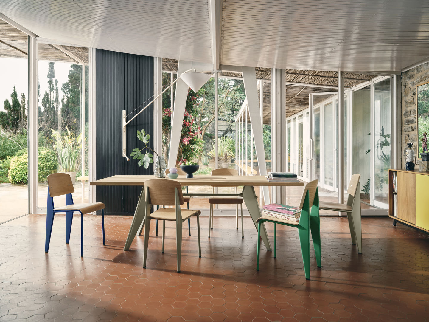

Furniture by Jean Prouvé has an artistic awareness that is expressed in the details, joints, proportions, static flows and overall construction, and ultimately in the processing and execution of the material itself. The final touch – the careful treatment of surfaces and selective addition of colour – was no exception. Jean Prouvé understood the depth of colours. As his daughter Catherine Prouvé says: ‘Prouvé chose his colours with great care – he wasn’t a painter’s son for nothing!.’
Made primarily of sheet steel, many of Jean Prouvé’s designs found their way into homes, offices, schools and universities. In addition to the fact that the raw material required protection from corrosion, he also understood that it would be enhanced by warm colour treatment. Prouvé therefore designed a range of colours that evolved according to the projects and their contexts, and that reflects the subtle nuances of nature or an artist’s palette.
Each colour was named after a source of inspiration, such as a particular plant, animal or artist. The individual tones seem to be handpicked from nature itself with a soft appearance that blends into any interior:


Prouvé Blé Vert, for instance, has the fresh colour of a field of young green wheat just before it turns to yellow, ready for harvest.
Prouvé Blanc Colombe is inspired by the off-white tone of dove feathers, which also reveal hints of grey-beige and yellow.
Prouvé Gris Vermeer refers to the famous Dutch artist Johannes Vermeer who was known for his extensive use of natural ultramarine. A closer look at the grey tones in Vermeer’s works reveals the source of Jean Prouvé’s inspiration.
Prouvé Bleu Dynastie is reminiscent of the cobalt oxide hue in the Ming dynasty blue-and-white porcelain.
Bleu Marcoule, on the other hand, has another story. Despite the fact this shade is closely associated with Jean Prouvé, it was not part of his own palette but a colour from an important client who ordered a great range of furniture from Ateliers Jean Prouvé.
Publication date: 17.10.2022
Author: Stine Liv Buur
Bilder: © SCE Jean Prouvé; Bits and Splits; Ackley Road Photos, Mikolaj Niemczewski; naytoong; Vitra


