I like to leave room for interpretation
A conversation with Sabine Marcelis
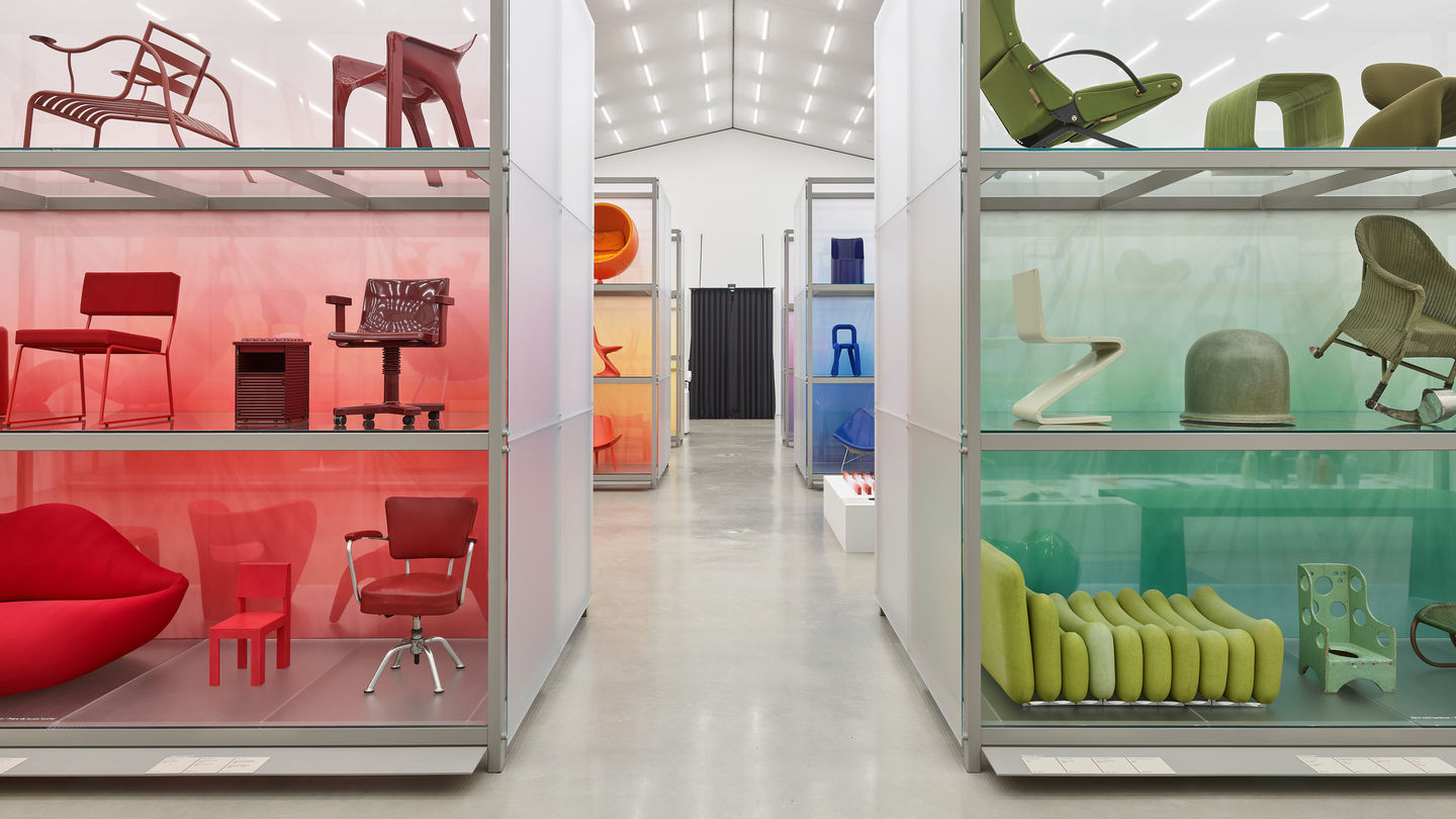
Change of perspective: The Rotterdam-based designer Sabine Marcelis has redesigned the presentation of the collection in the Vitra Schaudepot. Under the title «Colour Rush!», around 400 objects are now on display – sorted by colour! A conversation about bold gestures, unexpected pairings and the moment when an arrangement has reached a state of perfection.
Working with colours has been an important part of your design practice from the very beginning. Was it clear that this approach could be transferred to the collection of the Vitra Design Museums? Or did you have doubts? You know, people who sort books by the colour of the spine can make themselves a target for ridicule.
Sabine Marcelis: I know exactly what you mean. I’m not a fan of that either! Colour is not the right criterion for sorting books. You need a different system to find them on the shelf. But no, I didn’t have any doubts. After all, it’s not an exhibition on colour – that would be a very big topic. It’s an exhibition about design, but just presented in a different way. The idea was to bring a breath of fresh air to the collection. Until now, it was sorted chronologically, like a tour through the various epochs of design and its development. What happens when you simply fade out the historical references? It’s very liberating to consider the collection in this way. In my work, it’s often about finding a different perspective on an object, material or space. Usually a single bold gesture will suffice. And I like to leave room for interpretation. I like it when people see something different in my work than I do.
How does ‘Colour Rush!’ allow for this freedom of interpretation?
The exhibition is very accessible, such as for children or those who aren’t so familiar with design. Everyone can make their own comparisons.What criteria did you use to select the individual pieces in the exhibition?
The collection contains some 7000 objects! Together with the curators Susanne Graner and Nina Steinmüller, we defined certain restrictions to make the selection easier. For example, we decided to only show objects that are really just in one colour, with no colour accents or patterns. Susanne and Nina then made a pre-selection from the digital archive. There were so many black objects! Also many reds, oranges and browns – a lot of warm tones. On the other hand, it was more complicated with the green section. The purple, pink and yellow shelves were also difficult to fill. What was very important to us was to create a comprehensive representation of design with the installation and presenting pieces by designers from all continents.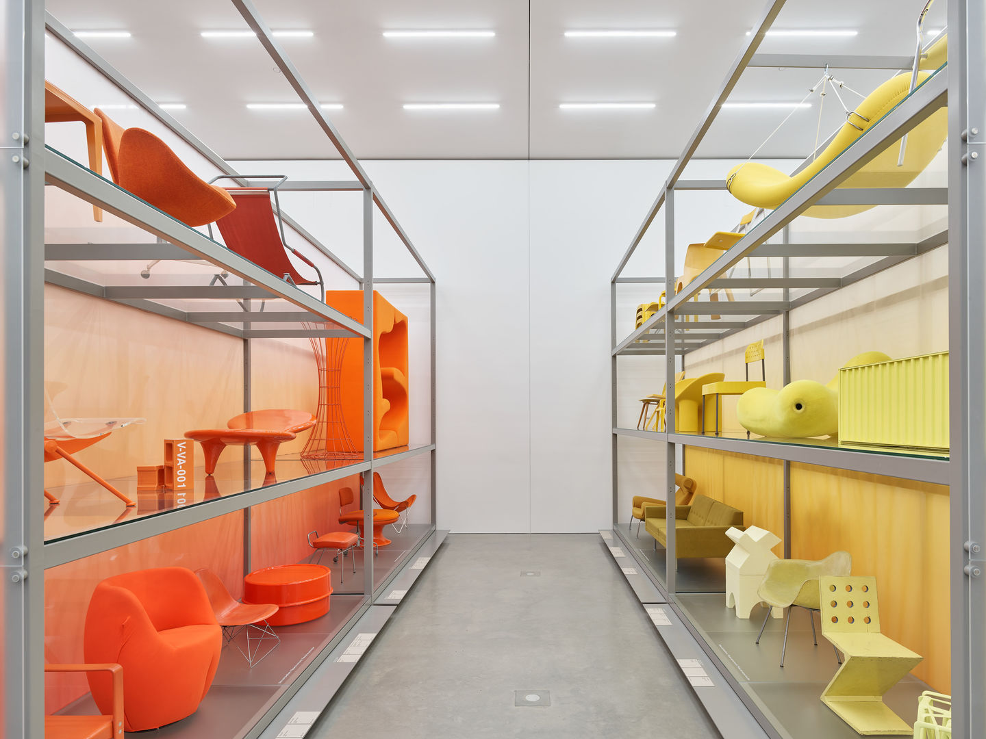

How did you arrange the objects?
The installation is structured like a colour wheel that we cut into and unfolded. When you enter the Schaudepot, you have purple on one side and the shelf with the complementary colour yellow on the other. Yellow is followed by orange, red and brown, purple is followed by blue, green and white, and finally grey and black. Between white and grey there are two pedestals with transparent objects. Within the individual colours, we grouped them by tone. And we tried to combine different materials, for example a plastic object next to an upholstered one. Especially with brown, there are some quite unexpected pairings – an old Thonet chair next to a transparent Panton furniture design from the 1960s. In any case, we worked very intuitively. There always came the moment when we looked at a shelf and knew: this is perfect.


A new ordering brings new insights, don’t you think?
When you look at all the objects from different eras and in different materials side by side, you see so much more! For example, I have been especially impressed by the production processes – like with the Aluminum Gradient Chair by Joris Laarman in the grey section, which is fabricated from 3D-printed metal. What I would not have anticipated: how calm and clear the installation has become. In the earlier computer simulations, it still seemed quite restless, with the photoshopped images of the different objects. But now that all the visually irritating elements are gone, I can see it more clearly. It may sound a bit kitschy, but that’s how it is for me.The installation also includes additional smaller presentations.
I developed a study of forty different cast resin samples to show how designers can play with colour and material. In the middle, there’s a sample without any colour at all, then with each successive sample the proportion of white, black or another colour gradually increases – creating an entire world in a single material!
Colour studies by other designers are also on view.
For most people, chairs come to mind when they think of the Vitra Design Museum collection. Yet there’s so much more! Textile swatches and wallpaper sheets, for example, or numerous material test samples by Verner Panton, colour studies by Le Corbusier and Hella Jongerius. ‘Colour Rush!’ was the opportunity to showcase all these objects and materials.Publication date: 25.7.2022
Images: 1.-2. & 10.: Vitra Design Museum, Foto: Mark Niedermann; 3.-4.: Vitra Design Museum, Foto: Mark Niedermann, © VG Bild-Kunst, Bonn 2022; 5.-9.: Laurence Kubski, commissioned for Disegno #33
Author: Jasmin Jouhar


