The Vitra Colour & Material Library
Extracts from an original text by Alice Rawsthorn
There was one subject that Hella Jongerius was determined not to study when she started design school in 1988 – textiles. "My mother had worked as a pattern maker, and she was always sewing at home, with piles of fabric on the table", recalled Jongerius. "I had a little sewing machine of my own, but I hated sewing. Then there was the female thing: the cliché of men studying industrial design and women textiles. So I thought: 'I’m not going to do it. I want to work in electronics.' But, of course, I found myself being drawn back to textiles."
Jongerius’s fascination with textiles has deepened during the course of her career as one of Europe’s most influential product designers. For the last ten years, she has conducted an intensive study of the qualities and possibilities of colour and texture in textiles and other materials for the Swiss furniture company Vitra. Her work has culminated in the formation of the Vitra Colour & Material Library, a resource intended to help Vitra’s employees and designers, as well as architects and other clients to make the most of the visual, sensual and functional aspects of its products.

Centuries ago the subjects of colours and materials were deemed so important that many rulers introduced sumptuary laws to restrict the use of coveted colours and materials to particular strands of society. In first century Rome, the Emperor Nero banned everyone except himself from wearing purple, and threatened miscreants with execution. King Henry VIII issued his own purple ban in sixteenth century England, while restricting cloth of gold to dukes and marquises, ermine and sable to nobles, and forbidding anyone below the rank of knight from wearing silk shirts. After the Industrial Revolution, so many new dyes, paints and materials were developed that bright colours and fancy fabrics were no longer the preserve of the wealthy.
By the early twentieth century, popular management theorists, like Frederick Winslow Taylor, were championing standardization as a means of enabling manufacturers to produce their wares quickly, efficiently and inexpensively. Minimizing the choice of colours and materials was an important part of the process, as the car maker Henry Ford acknowledged by encouraging his sales force to push black cars because black paint dried fastest. The fewer colours a company offered, the more important it was to pick the most popular ones. A new profession of "colour stylists" emerged to anticipate the next colour crazes.
"I had no knowledge of making sofas, but I knew that I wanted to give this one life."
Hella Jongerius graduated from design school in 1993. Like other radical young Dutch designers of the time, she strove to find new ways of imbuing mass-manufactured objects with the subtlety, idiosyncrasy and warmth that people relish in craftsmanship, and had been sacrificed in pursuit of standardisation. Often, she used artisanal references to imply (in a benign falsehood) that an object was handmade. The rubber of her 1993 Soft Urn vase bore telltale traces of its casting, and the clay of the 1997 B-Set dinner service was fired at such a high temperature that each plate or bowl emerged with tiny imperfections typical of antiques or handcrafted ceramics.


Jongerius’s first project for Vitra was a breakthrough both for her and the company. At first glance, the Polder Sofa looks distinctly odd, with seat cushions of different sizes, upholstery in varying shades of the same colour and the straggling cotton threads and mismatched bone buttons associated with shabby old sofas, rather than Vitra’s meticulously engineered modernist aesthetic. Like the flawed surfaces of Jongerius’s vases, the Polder’s oddities are intended to trick us into thinking of it as a beloved piece of old furniture, worn out after years of use. "I was so naïve", recounted Jongerius. "The Polder was the biggest thing I’d made, and the most complex. I had no knowledge of making sofas, but I knew that I wanted to give this one life and energy by breaking it up into different shapes and showing how colour can be distorted by different materials, and their reaction to light and shade. The evening before the launch, we changed the upholstery to more conventional colours. And the next morning we changed it back again."
Greys and light blues for Jasper Morrison; greens and burgundies for Ronan and Erwan Bouroullec
The Polder was a hit of the 2005 Salone del Mobile in Milan, and a commercial success for Vitra, which asked Jongerius to investigate how it could use materials and colour more adroitly. "Seeing how Hella masterfully combined and arranged a variety of fabric textures and colours into something new and energetic in the Polder Sofa made us think that she was the right partner to discuss colour and textiles", said Eckart Maise, Chief Design Officer of Vitra. "A product design project at Vitra involves close teamwork between an independent author-designer and an engineer from our research and development team", explained Maise. "Traditionally, their discussions revolved around construction, material, connections, tooling and technical requirements. Function and comfort are debated as much as shapes, sections and radiuses. But the development engineers don’t feel qualified to discuss colours, textures or finishes, which is why we built a colour and fabrics team to support the designers." Jongerius began in 2006 by scrutinising Vitra’s existing products and comparing their colours and materials with the original specifications in the archives, identifying areas of improvement.


The process of developing colours and materials that would make each product as engaging as possible is long and arduous. It involves analysing hundreds of products and materials, and intensive testing for any new or revised designs. Jongerius wants to see colours in industrial design that are as nuanced as those mixed by the brushes of great artists. But each new Vitra textile has to be tested for light and colour fastness, seam slippage, flammability and abrasion. And even a minor change of colour in a plastic requires more onerous procedures, such as placing the material in a light cabin for over two thousand hours to assess its light resistance. Jongerius and the Vitra team have also devised a system to ensure that the new hues are used effectively. Vitra’s palette now includes signature colours that typify the work of particular designers and are reserved for them, such as greys and light blues for Jasper Morrison; greens and burgundies for Ronan and Erwan Bouroullec.

The legacy of Jongerius’s decade of work for Vitra is visible in her Berlin studio, an old sausage factory in the Mitte district. Walls, tables and shelves are festooned with vividly coloured swatches of fabric, daubs of paint and miniature chairs from the Vitra Design Museum. Some of the miniatures are used to try out new shades for the full-sized version of the same chairs, including the Eameses’ Plastic series. Jongerius also requisitioned hundreds of miniatures of the Pastil Chair designed in 1967 by the Finnish architect Eero Aarnio, after discovering that it is the perfect shape for a colour testing tool. Lying on the floor of her office are dozens of ceramic tiles painted with coloured glazes and placed beneath the windows so she can observe the effect of changing light on each hue. A floor of the studio is devoted to Jongerius’s textile experiments, which have already produced two new fabrics for the Vitra Home Collection, Maize and Aura, both wools introduced in 2016.


Standing in one room is a big industrial wooden loom operated by two assistants, and beside it the tiny loom on which Jongerius weaves fabric samples for Vitra. An adjacent room houses her archive of textile prototypes on which she has tried out new weaving techniques, colours, fibres and embellishments. Designing more textiles for Vitra, mostly made from natural fibres like linen, wool and cotton for the Home Collection, will be a focus of Jongerius’s work in the future. She also plans to investigate other aspects of design with the same zest as her research into colour. "I am just starting to study the effects of daylight and artificial light on colour and texture", she explained. "Then I’d like to tackle shape, shadow and spatial design. This is something that could go on and on and on."

About the book:
The book "I Don’t Have A Favourite Colour" tells the story of Jongerius’s decade of experiments for Vitra in her own words. Drawing on the writing of Michel-Eugène Chevreul, Johannes Itten and other historic colour theorists, her weaving experiments on a tiny wooden loom in her Berlin studio and projects by twentieth century designers like Jean Prouvé and Verner Panton that she found in the Vitra Design Museum archive, Jongerius describes how her understanding of colour and materials has evolved during the process of compiling the library and developing new hues, fabrics and finishes for Vitra.
The book "I Don’t Have A Favourite Colour" tells the story of Jongerius’s decade of experiments for Vitra in her own words. Drawing on the writing of Michel-Eugène Chevreul, Johannes Itten and other historic colour theorists, her weaving experiments on a tiny wooden loom in her Berlin studio and projects by twentieth century designers like Jean Prouvé and Verner Panton that she found in the Vitra Design Museum archive, Jongerius describes how her understanding of colour and materials has evolved during the process of compiling the library and developing new hues, fabrics and finishes for Vitra.
About the author:
Alice Rawsthorn writes about design in the International New York Times, which syndicates her articles worldwide. She is also a columnist for Frieze magazine and an author, whose latest book, the critically acclaimed "Hello World: Where Design Meets Life", explores design’s influence on our lives: past, present and future.
Alice Rawsthorn writes about design in the International New York Times, which syndicates her articles worldwide. She is also a columnist for Frieze magazine and an author, whose latest book, the critically acclaimed "Hello World: Where Design Meets Life", explores design’s influence on our lives: past, present and future.
Publication Date: 06.10.2016. The original text was first published in the book "I Don’t Have A Favourite Colour"by Gestalten Verlag, 2016.
Author: Alice Rawsthorn
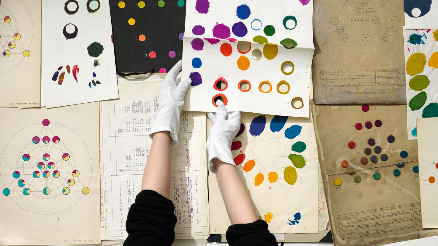
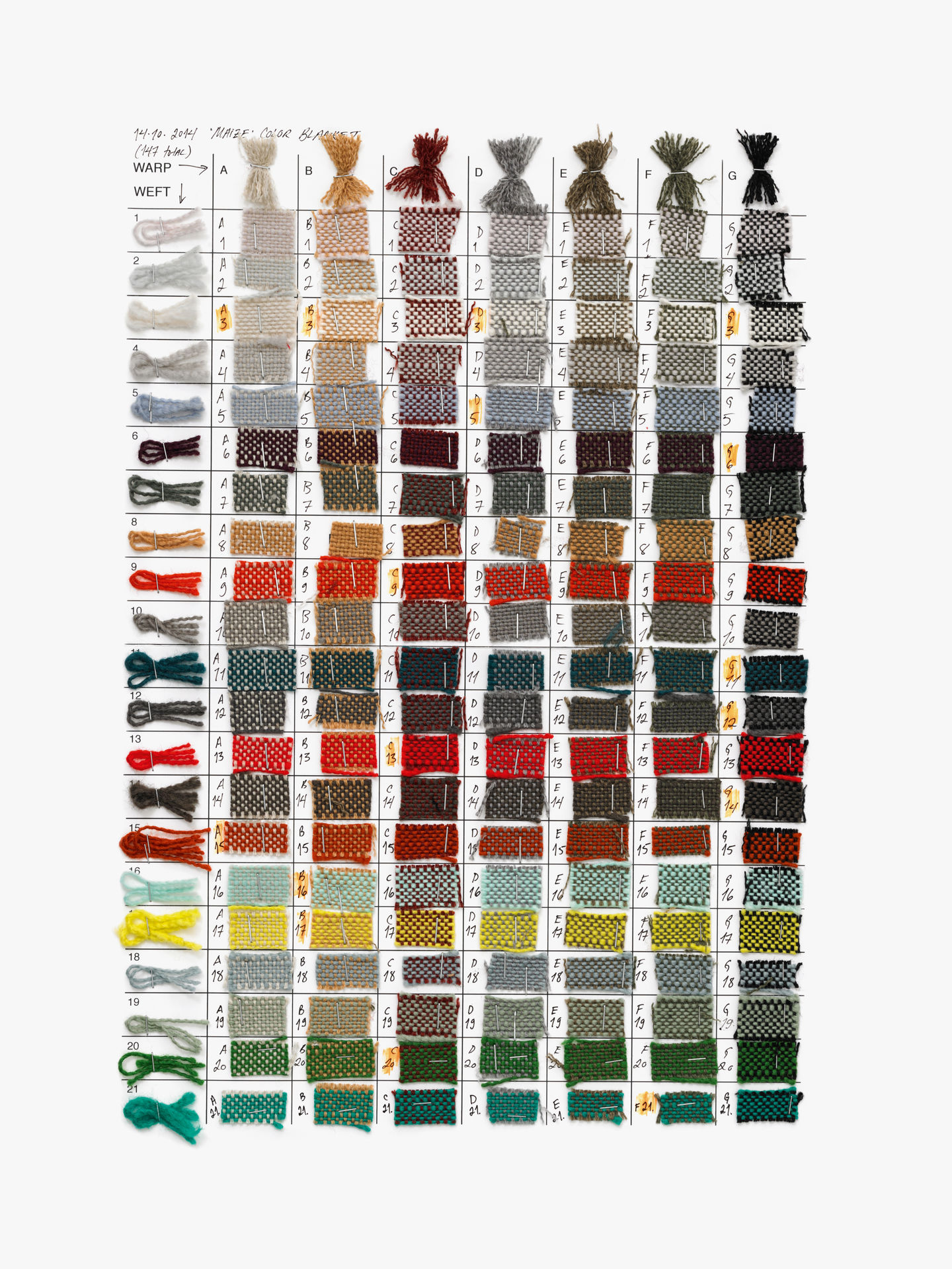
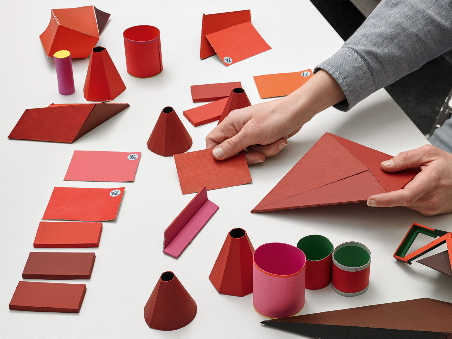
Images (in order of appearance):
Title: Studies by Verner Panton on colour mixing in paint and textile fibre. Photo: Labadie / van Tour, Copyright: Vitra. Reconstruction of the colour blanket woven for the Maize colour range. Photo: Labadie / van Tour, Copyright: Vitra. Samples and yarns used as a reference for colouring Maize. Photo: Labadie / van Tour, Copyright: Vitra. Colour research on three-dimensional red shapes, Photo: Labadie / van Tour, Copyright: Vitra. Textile selection for the 2015 update of the Polder Sofa and Sketch of the Polder Sofa. Photo and Copyright: Jongeriuslab. Textile study for the 2015 update of the Polder Sofa. Photo and Copyright: Vitra. Study for duotone weave using paper strips. Photo: Labadie / van Tour, Copyright: Vitra. Colour recipe research using historical colour chips as a reference. Photo: Labadie / van Tour, Copyright: Vitra. Sketch on volume and colour; Stack of Hopsak samples from the design process for the 2014 Hopsak colours. Photo and Copyright: Jongeriuslab. The Vitra Colour & Material Library, the red world. Photo: Labadie / van Tour, Copyright: Vitra. Design process for 2014 Hopsak colour range. Photo and Copyright: Jongeriuslab. Studio. Photo: Labadie / van Tour, Copyright: Vitra. Sketch showing Vitra products organised into the four colour worlds: reds, greens, lights and darks; drawing by Iris Toonen for Jongeriuslab. Photo and Copyright: Jongeriuslab. The realisation of the Vitra Colour & Material Library in products. Photo: Labadie / van Tour, Copyright: Vitra. Jongerius Lab Studio. Photo: Magdalena Lepka, Copyright: Jongeriuslab.


