Congenial Adaptation
Dries van Noten and Verner Panton
Cheerful and optimistic: fashion designer Dries van Noten had these ideals in mind for his Spring/Summer 2019 menswear collection. He found inspiration in textiles created by Verner Panton, and his sensitive adaptation of Panton’s designs resulted in a contemporary collection that is convincing right down the line. It is also making waves far beyond the world of fashion.
Fashion designer Dries van Noten, the most prominent representative of the legendary ‘Antwerp Six’, is indisputably recognised today as one of the most creative and idiosyncratic minds on the international fashion scene. His extremely diverse collections, which consistently contain an element of surprise, reflect his broad cultural horizons and almost effortless ability to transcend geographical borders as well as the boundaries between artistic genres and epochs. He had good reasons for seeking inspiration for his Spring/Summer 2019 menswear collection in the work of Verner Panton – and they have nothing to do with the persistent retro trend in the world of fashion and design over the past years.

When he started to conceive the collection last year, van Noten explains, he decided to adopt a distinctly optimistic approach. Due to the positive, uplifting effect of colour on people’s moods, van Noten chose colour as the main theme – an intentional sign of hope and joyfulness in the face of global conditions perceived by many to be ominous and bleak. In his search for inspiration and aesthetic points of reference, Verner Panton’s oeuvre soon came into focus. This was no coincidence, for Panton had used colour as an essential design element and explored chromatic properties and effects more intensively than almost any other twentieth-century designer. He especially valued the ways that colours can affect human emotions.


© Verner Panton Design AG
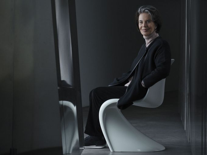
Panton’s view is summed up in the often-cited statement: ‘You sit better on a colour that you like’. Panton’s investigation of colour can be traced through his entire oeuvre and had an especially strong influence on his numerous textile designs. And Dries van Noten concentrated his attention precisely on this relatively unknown and underappreciated aspect of his forerunner’s work. Iconic designs like the Panton Chair or Heart Cone Chair, on the contrary, are sought in vain in the couturier’s collection.
Panton’s view is summed up in the often-cited statement: ‘You sit better on a colour that you like’. Panton’s investigation of colour can be traced through his entire oeuvre and had an especially strong influence on his numerous textile designs. And Dries van Noten concentrated his attention precisely on this relatively unknown and underappreciated aspect of his forerunner’s work. Iconic designs like the Panton Chair or Heart Cone Chair, on the contrary, are sought in vain in the couturier’s collection.


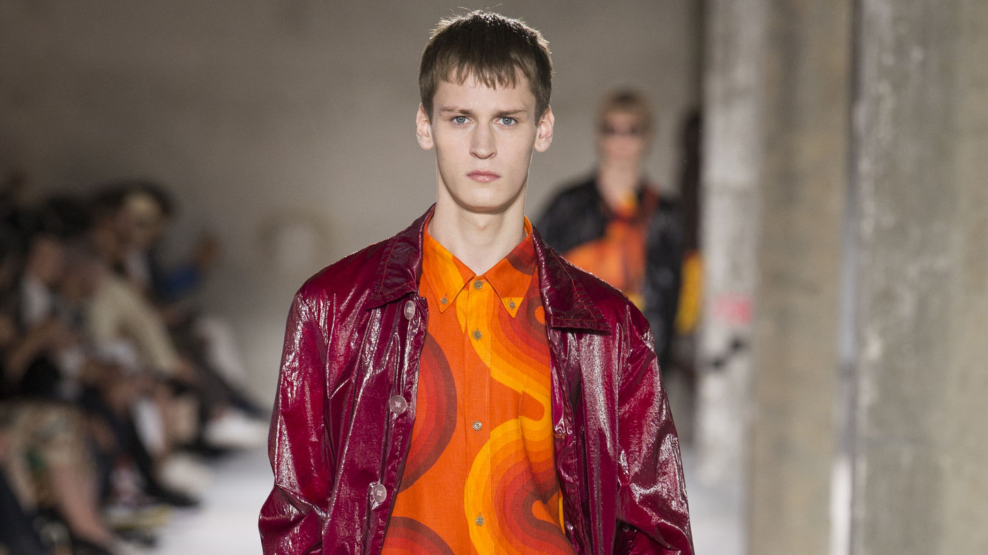
After the Panton family had consented to the collaboration with Dries van Noten, the designer sent a research team to the Panton Archive at the Vitra Design Museum in Weil am Rhein. The extensive photographic documentation from this visit was subsequently examined in his Antwerp studio. With an instinctive certainty, van Noten chose a few designs from the vast store of images that he found particularly appealing and felt were well suited for adapting to apparel: two motifs – ‘Hand’ and ‘Eye’ – from the Anatomical Designs originally created for the 1968 ‘Visiona 0’ exhibition, along with the designs ‘Curve’, ‘Wave’, ‘Stripe’ and ‘Square’ from the Decor 1 collection developed by Panton in 1969 for the Swiss textile manufacturer Mira-X.


© Verner Panton Design AG
Based on eight vibrant colours and a few geometric patterns, the latter collection holds special importance in Panton’s textile oeuvre – firstly, because he used it for some of his own famous interiors, and secondly, because he continued to develop and vary its basic elements over a period of many years. Dries van Noten took the very same approach in working with the Panton legacy.
One difficulty had to be overcome: Panton had designed home textiles (for upholstery and interior decor), not fabrics for clothing. The original sizes of pattern repeats and the properties of his fabrics were intended for their use in domestic settings. According to Dries van Noten, the worst thing that could have happened with his Panton collection would be if people thought he had found an old curtain at a flea market and made it into a pair of trousers. For this reason, he obtained the rights to alter the dimensions and colours of the designs in order to suit his purposes. He also sensibly emancipated himself from the historical designs in regard to the physical properties of the textiles and production techniques (e.g. digital printing).
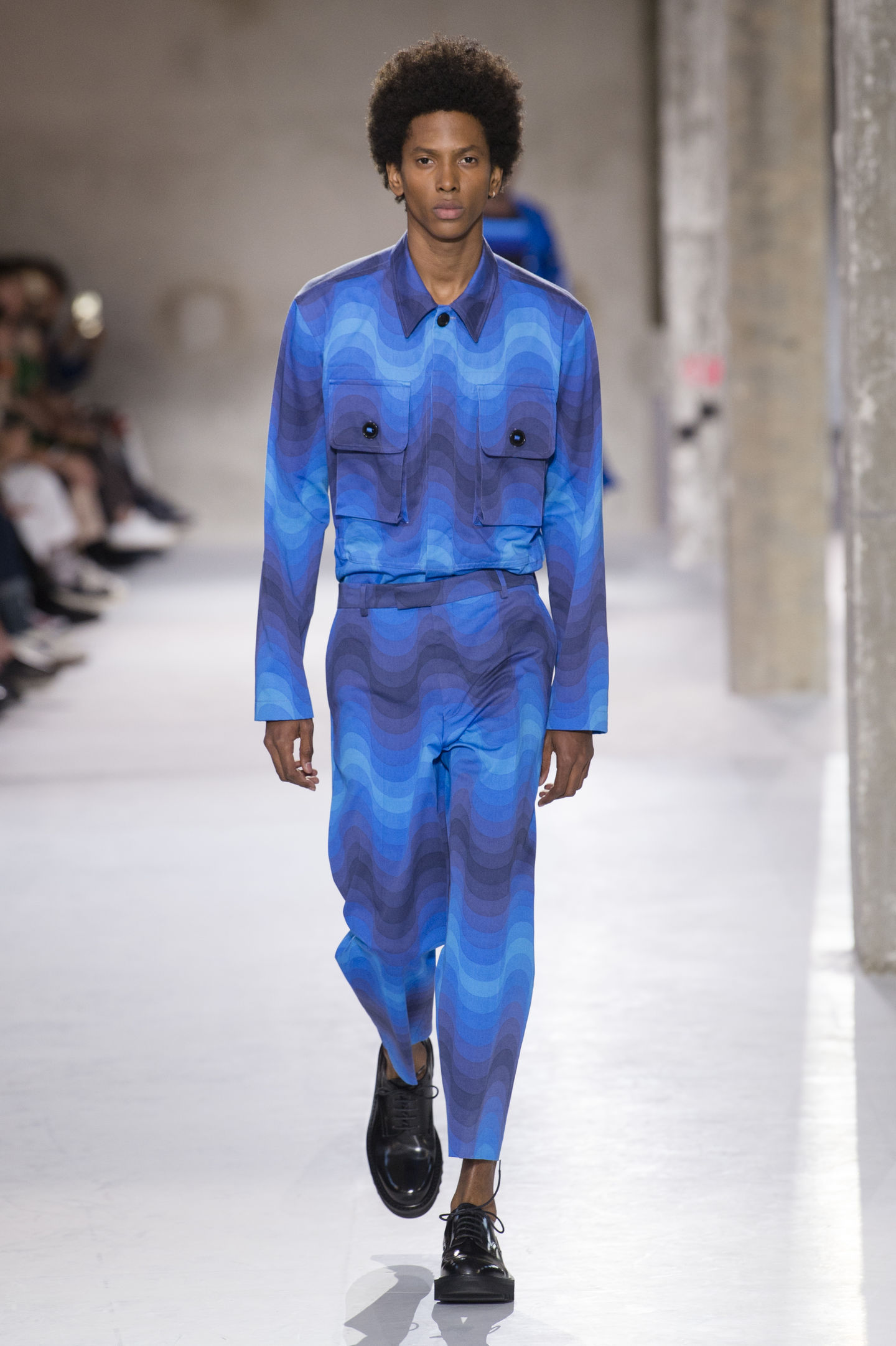
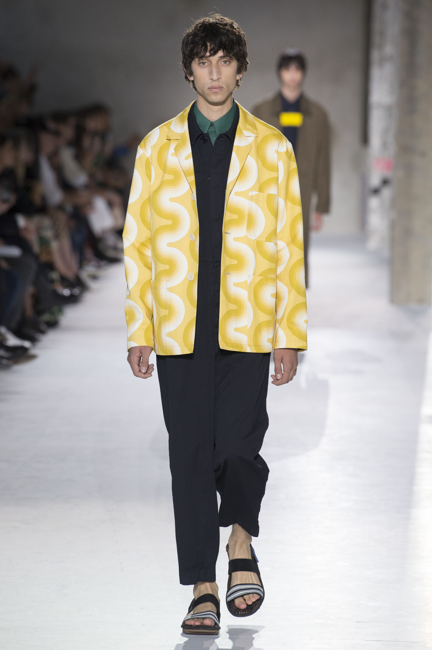
Dries van Noten explicitly describes his current men’s collection as an homage to Verner Panton, which has resulted in a sensitive translation and adaptation that convinces right down the line. On the one hand, it succeeds in conveying the positive feeling of the era when Panton originally created his designs. Yet on the other, the collection comes across as highly contemporary and free of any nostalgia.
The easy assuredness with which Panton’s designs were applied to the diverse outfits in this menswear collection is highly impressive – one might think that the motifs had been specifically created for this purpose. And yet Dries van Noten’s greatest achievement can be seen in those pieces where he deviates from his source with a colourful reinterpretation of the original graphics. In fact, these congenial adaptations are where he comes closest to reviving the spirit of Panton’s oeuvre.
The easy assuredness with which Panton’s designs were applied to the diverse outfits in this menswear collection is highly impressive – one might think that the motifs had been specifically created for this purpose. And yet Dries van Noten’s greatest achievement can be seen in those pieces where he deviates from his source with a colourful reinterpretation of the original graphics. In fact, these congenial adaptations are where he comes closest to reviving the spirit of Panton’s oeuvre.


The fact that two prominent women – the musician Beyoncé and actress Cate Blanchett – were the first to publicly debut pieces from the men’s collection can be understood as a commentary on current gender discussions. But this is also fully in keeping with the philosophy of Dries van Noten, who commented in an interview with the Neue Zürcher Zeitung: ‘I love feminine elements in my men’s collections and masculine elements in my fashions for women.’ Verner Panton would surely approve.
Publication date: 23.5.19
Author: Mathias Remmele
Images: Dries Van Noten, © Panton Design