Colour Rush!
An Installation by Sabine Marcelis
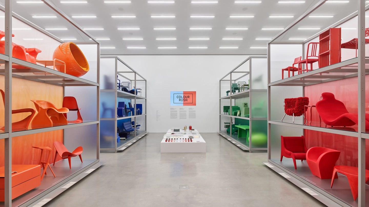
The presentation »Colour Rush! An Installation by Sabine Marcelis«, which will be on display until May 2024, is wholly devoted to colour. Following an invitation from the Vitra Design Museum, Dutch designer Sabine Marcelis has transformed the Schaudepot in one simple, sweeping gesture by sorting its roughly four hundred exhibits by colour. The installation shows the collection from new perspectives and produces fascinating cross-references between periods and styles, at the same time providing visitors with an overwhelming immersive experience. The presentation is complemented by historical and contemporary objects and documents from the museum archives that illustrate how designers from different eras approached the subject.
Our world is full of colour. Its various shades unleash emotions, assist orientation, indicate functions or perils, and mark cultural, political, professional, or religious identities. Although each of us perceives colours in their own way, all times and cultures have symbols and traditions distinguished by specific hues. This is one reason why colours play a central role in the design of interiors, fashions, and public spaces. But the colours we choose for our clothes and homes also reveal personal predilections and contemporary trends. Some architects, artists, and designers even use their handling of colour as their hallmark – just think of Le Corbusier, Yves Klein, or Hella Jongerius.
An homage to the role of colour in design across all periods and styles, the presentation plunges the Vitra Schaudepot into a sea of colours, offering an almost physical experience. Visitors discover contrasts, tonalities, and intensities and learn to understand the added effect of material and surface. »Colour Rush!« demonstrates why a careful choice of hues and shades is so central to home and furniture design in particular: natural colours tend to suggest a cosy atmosphere; bright hues stand for unconventional attitudes; exposed, unpainted surfaces may express a minimalist or purist philosophy.


In reflecting upon the many forms of using colour, a number of designers developed their own theories and systems. Well-known examples include the architect Le Corbusier, who devised a palette of carefully graded shades, and the designer Verner Panton, whose vivid colours communicated the hippie vibe of the 1960s and ‘70s. Fascinating documents from the Vitra Design Museum archives enrich the presentation: Verner Panton’s sketches and notes show how he worked on his colour system while sample books and design drawings offer fresh insights into the colour concepts of Alexander Girard, Hella Jongerius, and others. Yet art and design are not the only ways by which to approach colour. From antiquity to today, scholars and scientists have sought to develop standardised systems for sorting colours by their various qualities. The examples presented in the Vitra Schaudepot – RAL, Munsell, Pantone Matching Systems – are those that have come to dominate our colourful world today, from hardware stores to artistic interior designs.
The examination of colour is central to the work of Sabine Marcelis, who created the new annual presentation in the Vitra Schaudepot. Shiny surfaces, pastel colour gradients, and refractions characterise her designs. Marcelis made her name in furniture and lamp design as well as through her collaborations with brands like Celine or Hem, which she carries out with her Rotterdam-based studio. For »Colour Rush!«, the Dutch designer teamed up with the collection curators to select nearly four hundred objects which represent different colour groups and are shown against translucent backdrops in various shades. The resulting colour gradients create an immersive experience that conveys an impressive understanding of the museum’s collection and the colourful history of modern design.
The examination of colour is central to the work of Sabine Marcelis, who created the new annual presentation in the Vitra Schaudepot. Shiny surfaces, pastel colour gradients, and refractions characterise her designs. Marcelis made her name in furniture and lamp design as well as through her collaborations with brands like Celine or Hem, which she carries out with her Rotterdam-based studio. For »Colour Rush!«, the Dutch designer teamed up with the collection curators to select nearly four hundred objects which represent different colour groups and are shown against translucent backdrops in various shades. The resulting colour gradients create an immersive experience that conveys an impressive understanding of the museum’s collection and the colourful history of modern design.
Publication date: 23.05.2022
Images: © Vitra Design Museum, photo: Mark Niedermann © VG Bild-Kunst, Bonn 2022; graphic design: Judith Brugger